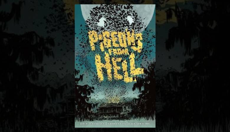
Pigeons from Hell is an adaptation by Joe R. Lansdale of a story by Robert E. Howard, with art by Nathan Fox and color by Dave Stewart. Lansdale is at pains to point out, in his “Notes from the Writer,” that it is really an “adaptation” — updated, exploring some new facets of Howard’s story, and not to be confused with the original, all of which leads me to treat it as its own creature.
Twin sisters, Claire and Janet Blassenville, have inherited the old Blassenville plantation. The estate was bequeathed by the last of the original Blassenville family, plantation and slave owners, to one of their former slaves, who also took the family name. The sisters, along with several friends, drive to Louisiana to inspect their property, and find a moldering dump filled with pigeons, the bodies of dead creatures, and something you wouldn’t want to take home to meet your mother.
I have to admit to an increasing fondness for books with pictures — lots of pictures. Take that to mean manga and graphic novels, in particular. Part of it is that I’ve always been fascinated by the interplay between words and images (and have done several works myself in that mode), and the way in which images themselves can carry a narrative thread: it’s to a certain extent an intellectual recreation for me, but also has a strong basis in the fact that we are, after all, a visual species, which gives this type of work an immediacy lacking in verbal text. At the core of this fascination is the understanding that both printed words and images are ways of presenting information on the page, and the success of the endeavor rests on intelligibility: if we can’t make sense of it, we come away with nothing.
Lansdale’s script is perfectly adequate if fairly predictable, but the graphics lost me — repeatedly. While I can’t fault the way the images support the narrative line in general, or the fact that Fox has relied on the images to carry the narrative in several places (something I am very happy to see in Western comics), there are also too many places where the action is lost: even knowing what was happening from context, I couldn’t see it. Part of this may be due to the palette: the story takes place at night, and colors are a low-contrast blend of blues, grays and purples. I think, however, that a large part of the fault rests in the drawings themselves: For example, during the sequence in which the sisters are pursued by a “shadow wolf,” I knew they were being pursued by something, but it completely lacked any detail that might have given it, not only identity, but impact as a threat. The problem is even more marked in the passages portraying the Shadow in the Corn — the real curse on the Blassenvilles and their plantation: except for one frame that gives more than a hint of HR Giger’s design for Alien, no detail, no definition, no impact.
This is by no means a constant problem — there are sections that are perfectly legible, although one critical scene, brightly lit though it is, is again marred by unreadable imagery. It’s prevalent enough, though, and the scenes affected are important enough, that I sort of felt cheated.
Both Lansdale and Howard expert Mark Finn, in their respective addenda, dwell on Howard, his original story, and express the fond wish that this volume will inspire readers to go back to the original. To be brutally honest, I’ve enjoyed what I’ve read of Howard’s work, think he was a fine writer, and have no desire to read this story on the basis of this book.
Sad, but true.


